|
|
Post by The Rubber Ball Man on Dec 23, 2018 21:46:36 GMT
|
|
|
|
Post by The Rubber Ball Man on Feb 22, 2019 20:39:24 GMT
|
|
|
|
Post by The Rubber Ball Man on Apr 15, 2019 21:18:02 GMT
|
|
|
|
Post by The Rubber Ball Man on Apr 15, 2019 21:19:38 GMT
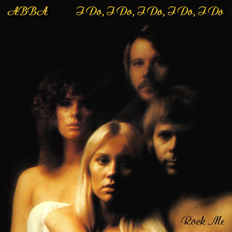 I absolutely love the way this has turned out. 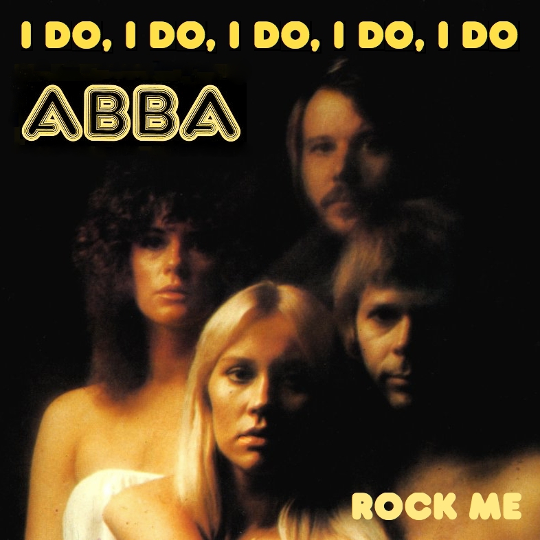 |
|
|
|
Post by ABBAinter.net on May 21, 2019 22:31:57 GMT
|
|
|
|
Post by thatABBAdude on Jun 2, 2019 21:18:12 GMT
Hey ABBA fans! I recently made a blog to share my own ABBA cover artwork on, but I really would love some other artwork from other ABBA fans as well. I would like to hear if any of are interested in helping me out? I will "advertise" the blog on my YouTube channel (thatABBAdude) and social media to, as I want to share these creations with the world and see everyone's creative interpretation of these covers. It have already spoken with The Rubber Ball Man, who actually inspired me to create the blog! (Thank you again! I owe you one!) I would still appreciate some more participants. ABBAinter.net has incredible artwork on here as well as Liebezeit and everyone else who share's cover artwork here. I do not want to upload artwork from here without anyone's permission. Please let me know and you can even send them to me to me email - babubuys.wb@gmail.com Any cover art of any style would be appreciated very much. Thanks! thatABBAdude (Wickus) HERE'S THE BLOG |
|
V
abbafanart.blogspot.com/ |
|
|
|
Post by Liebezeit on Jun 3, 2019 16:03:57 GMT
thatABBAdude, thank you for the shout out. It is always a relief to see some people are picking up graphic designing And go out there and make mock artworks Not only for building up skills But also realise the thoughts from one and put it into the canvas. (yeah, pseudointellectualism rubbish but why not.) Also, congratulations on getting Carl Magnus Palm to evaluate your sleeve artworks. That is holy status right there
|
|
|
|
Post by Liebezeit on Jun 3, 2019 16:58:57 GMT
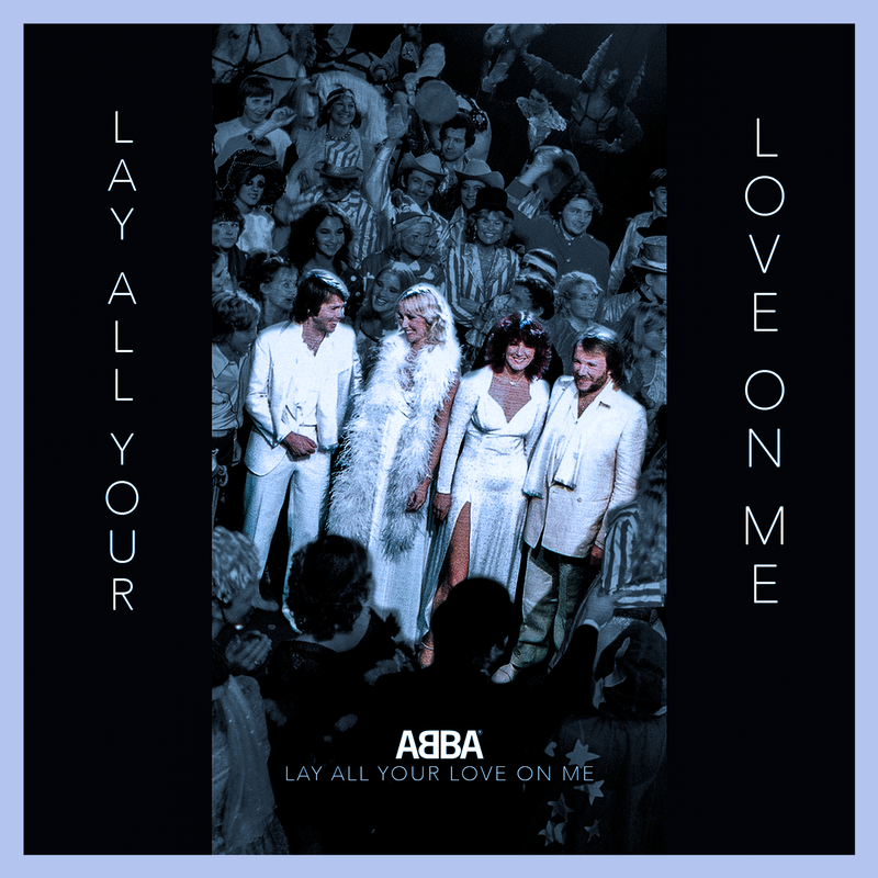
pure lazy editing |
|
|
|
Post by HOMETIME on Jun 3, 2019 21:19:03 GMT
|
|
|
|
Post by Liebezeit on Jun 3, 2019 23:31:29 GMT
^^
Tony, I haven't seen these designs before. Maybe perhaps "The Essential Frida" but not the rest of them.
Wonderful art direction. Certainly reminds me of that one design of Dusty Springfield's "Reputation and Rarities" which comes across as drastically different, and borderline grungy from the minimalist and san-serif design
It reminds me as if Anni-Frid and Co or Gorel / Polar had the integrity to acquire the rights to the recordings (through a legal battle) and bundle it up together as a fan treat (when in reality, Parlophone has Frida's pre-ABBA stuffs and all the other post ABBA stuffs are Polar's)
|
|
|
|
Post by HOMETIME on Jun 4, 2019 10:20:51 GMT
Thanks Jonathan. I indulge some fantasies where licencing is easier and where the vaults are not so tightly controlled, allowing for fan-pleasing re-issues and retrospectives. I genuinely believe that the Shine box set should be possible. With regard to the bonus material I listed, I have a hunch that a 12" mix of Twist In The Dark might exist, because it was originally earmarked for lead single and has a glossy video. I have only recently discovered that there seems to be an entirely new single version of Shine recorded specifically for the US market. It seems the American label didn't like the album and this new version of the title song was made with an eye on the American charts. It was never released, however. Clearly, such a track would be a fantastic bonus for a set like this.
I really like what you have done for your LAYLOM sleeve. The treatment of a photo sits very well with the electronic feel of the track. The font is very elegant - what is it?
|
|
|
|
Post by thatABBAdude on Jun 4, 2019 15:02:36 GMT
Thank you all for the support! I will certainly put your creations up on the blog! Love these covers! Especially the more modern twist! I always tend to go for the original feel, but I really like the more minimalist and modern feel.
|
|
|
|
Post by josef on Jun 7, 2019 20:20:43 GMT
I love the simplicity of the Like An Angel.... cover. In some ways, I wish ABBA had exercised such classy restraint during their heyday. Not that I minded seeing their smiling faces but from an artistic, enigmatic point of view, it works to retain some mystery.
And the Frida/ Career design is inspired! I could actually see that on the shelves at HMV!
|
|
|
|
Post by HOMETIME on Jun 8, 2019 11:18:43 GMT
Thanks, Josef! That's really kind of you.
My main beef with ABBA sleeves was the tendency to have beaming smiles fronting heartbreak ballads. Although it's actually one of my favourite single sleeves, the one chosen for The Winner Takes It All is completely at odds with the song. Likewise The Day Before You Came. I love the European sleeve for Voulez-Vous/Angeleyes and Eagle. The US sleeve for Take A Chance On Me was great too. Epic really hadn't a clue when they finally bothered issuing picture sleeves. They did a lovely job with the gatefold for I Have A Dream but missed the mark with One Of Us and Head Over Heels - I suspect they were spooked by Frida's post-divorce screw-you punky hairdo and insisted on pics of the perm. For me, the UK sleeve for One Of Us is their least flattering.
|
|
|
|
Post by The Rubber Ball Man on Jun 8, 2019 16:18:39 GMT
Epic really hadn't a clue when they finally bothered issuing picture sleeves. They did a lovely job with the gatefold for I Have A Dream but missed the mark with One Of Us and Head Over Heels - I suspect they were spooked by Frida's post-divorce screw-you punky hairdo and insisted on pics of the perm. For me, the UK sleeve for One Of Us is their least flattering. I totally agree with you. I also think that When All Is Said And Done should've been released and The Visitors would've been a better A-Side choice in my opinion. So I did these covers recently. (I used the maxi banner just to make it a bit more exciting) 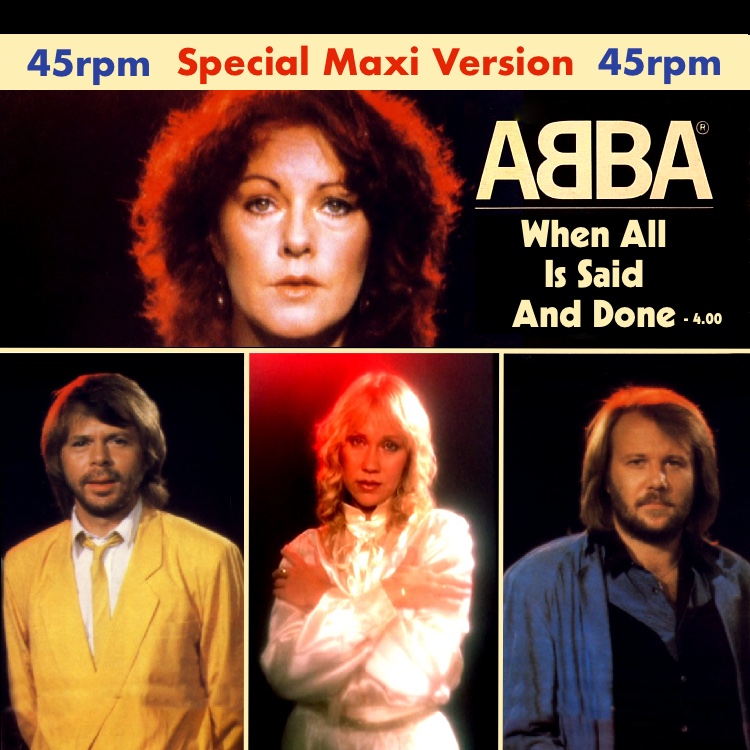 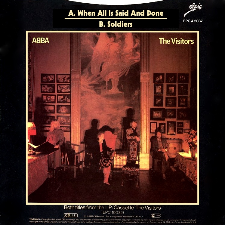 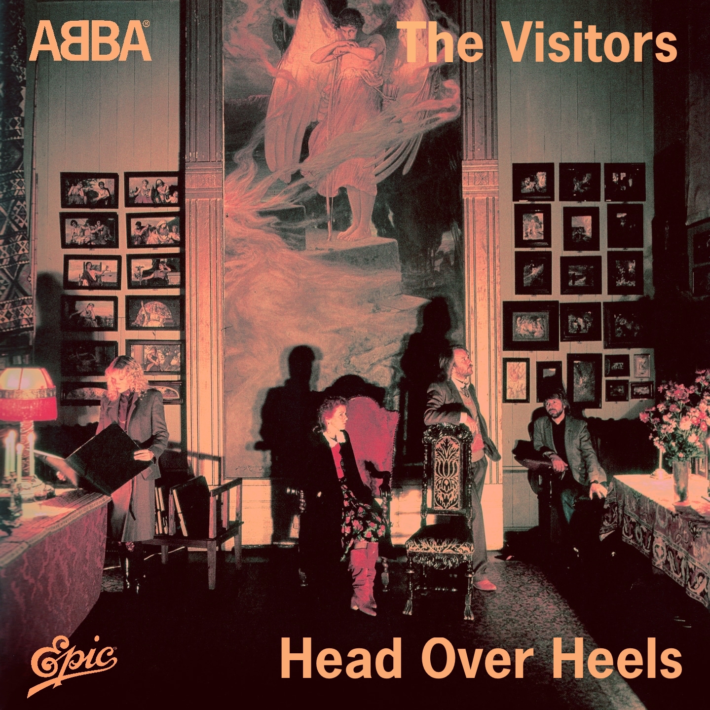 |
|
|
|
Post by HOMETIME on Jun 8, 2019 17:18:07 GMT
Your WAISAD sleeve works really well - especially because it's based on stills from the video (and the sadness that Frida said is contained in the song is almost palpable in this photo). I totally agree with you about the single choices from that album. One Of Us was a great lead single but, yes, WAISAD should have been next and The Visitors would have been a great - if slightly brave - third release (ideally edited/remixed for 7" and extended/remixed for 12"). I think that The Visitors would have better prepared the public for the left-of-centre beauty of The Day Before You Came later in the year.
I understand why album tracks were sometimes used as B-sides over the years but, with this album, it seemed especially wasteful. Knowing that they were available, it seems odd that they didn't use the Dick Cavett live tracks as B-sides/bonus tracks and leave the studio versions/album tracks in place for exploration as part of the glorious original album.
|
|
|
|
Post by thatABBAdude on Jun 9, 2019 18:30:51 GMT
I must also agree! Epic takes the cake of worst picture sleeves (Italy's Epic sleeves for example, like their Gimme! Gimme! Gimme! looks stunning!) Alex, these are totally going on the blog haha! You did such a great job with these! I haven't forgotten about making my interpretation of a better-looking One Of Us Epic design. I'll get working on that. Also, Tony, thank you for the follow on my ABBA Covers blog! I'd love to see some more covers from you to upload there! Your "I Am The City" one is just simply magnificent!
|
|
|
|
Post by thatABBAdude on Jun 9, 2019 19:23:43 GMT
![]()  Ok here they are. Yes, I did all 3 in less than 40 minutes... That means they aren't that great, but I'm not mad about how they've turned out. I've made 3 versions of how I would've liked to see One Of Us released in the UK. The original was absolutely terrible and then Epic proceeded to make a picture disc of it! Nonetheless, it's still easily recognisable. The first one isn't great at all... I think it's different and I like the picture and the blue background goes well with the grey and white. The second one may look a bit too modern for '81. I spent most of the 38 minutes cutting them out and made the background transparent so that I could overlay them over the ABBA logo. I still like it, though. The third one is my favourite. It has the same feel like the cover most releases had and the text has the exact same colour swatch as the text on the original/ugly Epic cover. What do you think of these? Which one is your favourite?     |
|
|
|
Post by HOMETIME on Jun 9, 2019 19:36:29 GMT
Also, Tony, thank you for the follow on my ABBA Covers blog! I'd love to see some more covers from you to upload there! Your "I Am The City" one is just simply magnificent! Well, thank you again for the lovely words. I must say that the real credit goes to Tang Yau Hoong, a wonderful artist whose image "Beware of those hands!" is what I based the sleeve around. I fell in love with his work a while ago and I bought a few pieces to frame at home - including this one. When I saw it, I was struck by the way it reminded me of the work on ABBA The Album. So I hope nobody was labouring under the mistaken idea that I'm some kind of genius artist! I love your One Of Us sleeves. The image on the first one is my favourite. If SILOC wasn't listed on the front cover (or shrunk to fit directly under the main title), you might feel better about it? I really think it's an elegant design idea. I agree that the third one has terrific impact. You are a true ABBA purist, including the B-side title on the front of the sleeve. They seemed to do that more than most artists, I think. |
|
|
|
Post by The Rubber Ball Man on Jun 9, 2019 20:42:41 GMT
What do you think of these? Which one is your favourite?    I really love these covers. Your first one reminds me of the Yugoslavian cover and the second cover has Under Attack vibes. Your second and third covers are my favourites. :format(jpeg):mode_rgb():quality(90)/discogs-images/R-3749307-1470770688-6932.jpeg.jpg) |
|
|
|
Post by Liebezeit on Jun 10, 2019 22:59:01 GMT
^^ thatABBAdude , way ahead of you, but a coincidence otherwise, as I did it years ago :-) Speaking strictly of the current situation where licencing is a nightmare, the Gold artworks you made would have worked well, but the logo for Frida doesn't quite get a zing and a catch all "legacy" hearkening back to their heydays as your Agnetha Gold does, instead reminding me of the grey market "European Union copyright expired music" covers. Excuse my harshness, I didn't mean to, but that's how I would view it. In my opinion the artwork Frida Gold should have worked best with "Frida ensam era" Frida logo, or the "Something's Going On era" Frida logo. My artwork for Frida Gold had Frida's signature, but that's because I would have envisioned the "ABBA Gold boxed set" as accompanying and thought my interpretation of the Agnetha Gold and Frida Gold artwork would have coupled well with the standard ABBA Gold/ORO cover. Nonetheless - you executed the concept very well. 8.7/10 (The Polar Music AB "so-called unrestrained licenced" version) abbachat.boards.net/post/11765/thread (Frida Gold) abbachat.boards.net/post/11764/thread (Agnetha Gold) (A comprehensive Agnetha compilation album chronicling her particular solo years, the Sony Music version) abbachat.boards.net/post/11760/thread |
|
|
|
Post by thatABBAdude on Jun 12, 2019 22:53:14 GMT
|
|
|
|
Post by madonnabba on Jun 15, 2019 7:33:11 GMT
Liked most of the single covers but only remember the Uk getting photographic covers from Angeleyes on. Before they were just in simple yellow or orange sleeves with a hole in the middle to show the middle of the single. Did not like One of Us or TDBYC covers. Album wise hated the first attempt at an Abba live album...... a sketch of a stage which just looked so 80s and cheap. And what a horrible dull cover for Greatest Hits 2. Did not like the photograph or the dull colour of the cover. Favourite album covers GH1, Arrival and The Album. Wish they had came up with a better cover for Gold and better picture on the reverse.
|
|
|
|
Post by The Rubber Ball Man on Mar 28, 2020 22:52:10 GMT
|
|
|
|
Post by The Rubber Ball Man on Mar 28, 2020 23:05:50 GMT
|
|
|
|
Post by The Rubber Ball Man on Mar 29, 2020 17:15:00 GMT
|
|
Deleted
Deleted Member
Posts: 0
|
Post by Deleted on Mar 29, 2020 17:31:01 GMT
Rubber Ball Man and thatabbadude, I love your artwork. The photographs are stunningly beautiful. I wish I had both your artistic flairs. A great job.
|
|
|
|
Post by The Rubber Ball Man on Mar 31, 2020 20:12:09 GMT
|
|
Deleted
Deleted Member
Posts: 0
|
Post by Deleted on Mar 31, 2020 22:20:21 GMT
These photos are absolutely beautiful. So much better than the actual old '7 inch record picture sleeves. I love looking at them. Great work.
|
|
|
|
Post by The Rubber Ball Man on Mar 31, 2020 22:26:22 GMT
These photos are absolutely beautiful. So much better than the actual old '7 inch record picture sleeves. I love looking at them. Great work. Thank you. I’ve even made more Chiquitita style covers with the original fonts used for each Voulez-Vous single. Haven’t got time to upload them now but I will soon. |
|