|
|
Post by Roxanne on Oct 11, 2014 11:31:11 GMT
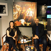
We are guested by the the Swedish book- radio- and tv- profile Anna Charlotta Gunnarson who together with Mattias Hansson (CEO, ABBA The Museum) discuss some of the many, sometimes strange, connections between pop and politics. The talk will be in Swedish. Read more about the event here: goo.gl/uAoaLZ. www.facebook.com/?ref=tn_tnmn#!/AbbaTheMuseum  |
|
|
|
Post by 15/11/79 on Oct 12, 2014 22:26:16 GMT
Wow - that huge ABBA album cover!
it also has the original font. I hate the way they updated it for recent releases, just doesn't work.
Martin,
Ireland.
|
|
|
|
Post by Ausfan on Oct 13, 2014 12:26:58 GMT
Wow - that huge ABBA album cover! it also has the original font. I hate the way they updated it for recent releases, just doesn't work. Martin, Ireland. I agree Martin - I loved the original font - it is a shame they changed it - this album cover was always one of my favourites  The font made it kind of special too. I am certainly not one to think the font should have been the same on every album - nor that re-releases needed to have the backwards B logo - keep them as original I say ! Roxanne Australia |
|
|
|
Post by dizzymoe33 on Oct 13, 2014 17:02:38 GMT
I agree with you both as well. I liked that font that was used on the original album cover.  ) Monica Poulsbo, WA USA |
|
|
|
Post by maxisaxi on Oct 14, 2014 0:10:28 GMT
Sorry to differ although the original art work is dear to me as well I do actually prefer the 2001 editions.
The Official ABBA Logo is Icionic but very classy. The only one I hated was the distarious 1992 one with Abba Gold.
Maxisaxi
New Zealand
|
|