|
|
Post by Liebezeit on Jan 29, 2017 4:24:03 GMT
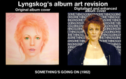
So I've found a thread about ABBA's album art reworking: www.abbachat.com/thread/587/cover-artwork-photo-sessions-scans, and I was inspired by that particular thread (but I didn't want to bother with it, thus, I started this thread with Frida because this topic is mainly about how Frida's album covers would be interpreted by other art directors [like me, but I wouldn't consider myself necessarily an art director]) I wanted to do the same with Frida, as well, because I'm quite fascinated with album covers. I wanted to use my photoshopping skills to interpret the album art in a way that feels connective to the songs they had. Shine's album arts had two alternatives because I couldn't decide the two images between 'Tough Frida' and 'Nurturing Frida' Frida: This album art is essentially the same, but with better dynamic ranges. Frida Ensam: A drastically different album art featuring Frida and her cat, as most of her song contents are mellowed down (Mostly side two's contents, I couldn't remember all but ett liv i solen!) Something's Going On: Frida behind a wall of text "SOMETHINGSGOINGON". If I wrote the song title instead of the text, I don't think that kind would make it, though, her single 'I Know There's Something Going On' is the main single from the album Shine: Artwork concept is the same except there are straight lines Djupa Andetag: A mere picture of Frida sitting on the chair: the lake in background (Lugna Vatten may be one of the inspirations for it) Some album arts have minor adjustments, some have drastic changes that are in the style of minimalism. What do you think of the revisions?  Feedbacks are appreciated Feedbacks are appreciated![]() ![]() 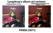 
   |
|
|
|
Post by Liebezeit on Jan 29, 2017 20:46:27 GMT
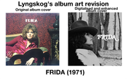 So I finally managed to do another drastic rework in Frida's debut album artwork like I did to the other albums, and make another minimalist approach to it. It kinda looks like some soft rock / country album art in this. Maybe perhaps I was inspired by one of them.  |
|
|
|
Post by Liebezeit on Feb 5, 2017 0:50:14 GMT
No feedbacks or comments? Well, at least I've made a thread that relates to the subject a bit well.
|
|
|
|
Post by chron on Feb 5, 2017 2:42:41 GMT
Only just seen these. After a quick look, I think the most successful are the ones for Djupa Andetag and Frida Ensam. The one for Djupa Andetag distinguishes itself for one thing because the original is a bit of a mess(!), but you've managed to place a single image on a plain ground in a way that gives it an assertive strength. Since it's such a 'simple' idea for a layout, a single photo floating in the middle of an area of flat colour is hard to get right (it's one of yer amateur designers most used ideas, and often ends up looking, well, amateurish); you have to get things like the scale right between the two main elements, and use a background colour that offsets the photo harmoniously. In this case, the darkish areas of blue, green and grey work well off white, and the long vertical of the photo is nicely balanced against the columns of white at the sides particularly.
The one for Frida Ensam isn't better than the original, but it might be as good. The pink blush towards the edges softens the white, and the skinny typeface is attractive and seems to 'chime' with the time that the original album was made,in some way. I prefer the photo you've chosen over the original as a portrait of Frida, although the lighting and the hand-colouring of the original cover image are very well handled, and the typeface rounds it off really well. Your design reminds me of an another album cover, although I haven't yet figured out which one.
The least successful is the one you've done for Something's Going On, not the the original design is much better. The photo you've chosen isn't especially strong or flattering (Frida looks drained, which you could argue fits in with the theme of the title track, but I don't think that's a good enough reason to run with it); it hasn't been 'cut out' with much care, and the wall of grey text doesn't juxtapose well or make much conceptual sense. The drawing on the original is fairly horrendous though, isn't it, and the typeface choice and decision to angle the text are iffy too. The general colour of it is quite pleasing, if you squint at it so that you lose the detail and see the whole thing more impressionistically.
|
|
|
|
Post by Liebezeit on Feb 5, 2017 3:43:39 GMT
Thanks for the constructive criticism!  I make no excuses for the repetition of the text in the 'Something's Going On' revision album cover, but I kinda made it more like it's one of the lazily made shelved single covers for the title track and music magazines covers, now that I see it, based on your feedback. (But it doesn't stop me from trying to revise the SGO cover, though, the laziness was attributed to my multi-tasking) The original cover of SGO, in my opinion, was better without the text (Poyet's drawing isn't severely bad, but it looks more like a distorted kind of a formal portrait to me), though, that could leave others in confusion for the record store buyers if I was given the authority of art direction. After all, it's only a theoretical but informal revision of album arts.  Some of the album artwork revisions (with the exception for Shine's revision) happened to be inspired by the other artists' Great Britain [sic, as most 60s-70s British LPs printed the country as that name] vinyl covers as, in my opinion, they tend to be more uniform, and well art-directed, by typeface and the choice of images than the United States and/or international vinyl covers. |
|
|
|
Post by The Rubber Ball Man on Feb 5, 2017 9:42:34 GMT
I really liked the SGO though and the Ensam one looks more like a single cover!!!
|
|
|
|
Post by Liebezeit on Feb 5, 2017 15:46:54 GMT
I also liked that SGO idea, but I disliked how I trimmed it in the near end when I painstakingly typed all of the text, or in short, translating the idea to my frantic abilities. c: Perhaps the Ensam revision resembling like a single cover was due to the placement of the Polar Music | Mono & Stereo symbol?  Coincidentally I've been revising this alternative album art and this shows an obvious inspiration Frida Ensam à la 'Barbra Joan Streisand' (1971) album. :-) The original cover of 'Frida' could be inferred as an homage to Janis Joplin's Pearl, so it's one of the reasons why I've done it in the same manner toward 'Ensam'. |
|
|
|
Post by chron on Feb 5, 2017 18:07:16 GMT
The original cover of 'Frida' could be inferred as an homage to Janis Joplin's Pearl Pretty blatant, isn't it. Frida's team were probably trying to prod the minds of potential punters into making a subconscious connection between the contents of Pearl and the likely contents of the Frida album. The Frida Ensam cover is broadly from the same 'school' of cover-design, as well - the boudoir setting, the inclusion of the chair, set close against a back-wall, etc. Looking at Frida Ensam again - despite its lovely treatment (that hand-colouring is really nicely done), the provocativeness of the original cover is a bit heavy-handed. Your revision scores marks over the original in terms of taste and restraint! Incidentally, looking at the two versions of Something's Going On again, I've now realised that the cover drawing on the original must've been based on the photo that you've selected for the cover of your revision version. The artist has candy-boxed it up a bit (softening the drawn look that's on her face in the source photo), but you can tell from the way that the strands of hair fall over Frida's forehead in the same way that it's based on that snap, or one from the same photo session. |
|
|
|
Post by ABBAinter.net on Feb 5, 2017 19:36:59 GMT
|
|
|
|
Post by Liebezeit on Feb 5, 2017 22:03:51 GMT
[ ABBAinter.net ] Philippe, those are some great artworks for Frida's single covers, But, in my opinion, it stays rather too true to the original timeline. My vision of the artwork (except for Shine, it's perfectly well adjusted for 1984, with a few tweaks because the jagged lines are quite too much of a nuisance) revisions has something to do with the polar opposite of the original artwork's concept. Shine's singles covers aren't bad in terms of revisioning, and Alla Mina Bästa År's single cover has a faithful vibe to the original album cover. The "Jag Ar Mej Sjulv Nu" single cover could have used a different typeface instead of a typeface that resembles Cooper Black. It makes the cover look like a bootleg of Frida's outtakes – or, it looks rather too contemporary to be from the 1970s, better yet, that typeface is something that could have been part of an indie pop (whereas Frida isn't) single cover. But, ignoring the typeface, you've done the Ensam period justice. The Something's Going On singles covers, however, are quite true to Polar and Epic Records' historical promotion singles cover, so I'll have to give props to that. Your reworked album artwork for Something's Going On is quite a bit of a reduced exposure version of the original one, so I'm not sure how to say about that, except, it has a rather subtle effect on it. I have a 1920 x 1080 Acer monitor and I'm not quite a big fan of bleeding colours, let alone, being a fan of natural, flat colours (not raw pictures, but pictures that are well cared and adjusted for suitable viewing) that might sit well since I own around 60 LPs and most of them are printed in flat colours, thus, I'm more used to that kind of art style. The bleeding colours are better off for CD/maxi-singles/Japan mini-album versions. 4.1/5. Not easily impressed. It's not superior to the original due to the bleeding enhancement, but it's a fantastic replacement for worn out single covers. |
|
|
|
Post by chelseacharger on Feb 5, 2017 22:47:25 GMT
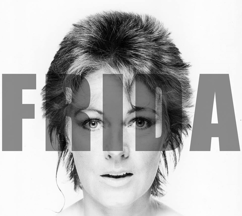
Think it was mentioned on another topic but always thought they should have used the same image that appeared in the 'IKTSGO' video for the 'Something's Going On' album cover.
|
|
|
|
Post by The Rubber Ball Man on Feb 5, 2017 22:55:26 GMT
I think that image should've been included on the back of the album instead of the Ring Ring effect
|
|
|
|
Post by Liebezeit on Feb 5, 2017 23:08:41 GMT
This photo kinda makes more sense in the context of the album artwork, and most of the photo sessions from the time period would have been made as one of the gatefold album covers, interior and exterior, for SGO, instead of cramming all recording info like 'Frida Ensam' and 'Something's Going On' back covers did. Though when any photos can be interpreted in different ways, my interpretation toward this image, 'A realisation that she's discovered that someone's cheating on her', oddly would be applied to the title song itself. Seems to me that the trousers fit just right. I kinda agree with you on the inclusion of this image for the SGO cover.  |
|
|
|
Post by Liebezeit on Feb 6, 2017 2:44:18 GMT
I didn't have to tamper with the text, but I colourized it just for the sake of it (it's rough and messy, but somebody has to do it, at least). since I'm working on trying to re-evaluate what went wrong with my SGO album art. This is only just a sample of it. I can't publish all of what I'm working on, since it might take a lot of space for a thread, but thanks chelseacharger for the high-res image.  |
|
|
|
Post by The Rubber Ball Man on Feb 14, 2017 18:52:58 GMT
I've tried to find those fonts to make some covers but never had any luck whatsoever. What are those fonts called please? |
|
|
|
Post by wombat on Feb 14, 2017 21:16:51 GMT
thanks for the links. Some of the printing or colors on some of the 1982 era original Frida covers are strange. The inside sleeve to the SGO album, for example. I dont know what happened there.... was that a decision to print it like that or was there a problem with the printer? Its almost like theres no blue or black in it. Its a horrible image of a beautiful lady... just weird.  And then some of the images from that time period are way too hot on the red side. I tried leveling out or curving the same image you used on To Turn the Stone and its awful to work with. Another one that I wonder why they did that.... Perhaps that was a tie in to I See Red ... maybe. Theres one pic where she has a headband on and there's a small slip of her red hair hanging over it. In some reproductions it looks like blood and when I first saw I thought, Soldier? Car accident? Anyway, good ideas and nice work! Nothings ever going to top that original Ensam cover ;-) hottest thing any of them ever made.... |
|
|
|
Post by Liebezeit on Feb 14, 2017 22:19:43 GMT
Thanks, haha! Yeah, that's what a few others in this thread said about the Frida Ensam cover (mine won't surpass the original). One of the cat photo sessions could have been used as a gatefold because wow, that back cover of Frida Ensam was quite grotesque and illegiable by terms of typeface.. I am personally a fan of gatefolds, so it looks like there's always something interesting to look at.
I don't know why Polar's printing press did something to the inner sleeve. It could have been a contrast to Olivia Newton-John's Physical years, considering that both of them were "hot" but styled in a different colour for the album arts in the manner. Yikes, the 1980s record pressing plants were definitely not in a great shape at that time.
|
|
|
|
Post by The Rubber Ball Man on Mar 5, 2017 16:56:30 GMT
|
|
|
|
Post by Liebezeit on Mar 5, 2017 23:28:30 GMT
 I am a great admirer of vinyl gatefold sleeves, so the time for me has come to post one of them because Frida Ensam's original back cover is a total mess with the unnecessary cursive. Frida Ensam's fanmade gatefold sleeves isn't well represented since it uses extracts from cassette tapes and CD booklets, but you'd get the idea of it. (I tried to stay faithful and blur the lines of ideas between mine and Rune Söderqvist as many of you said that nothing can beat the sensual feeling of Frida's legs in the album cover  ) |
|
|
|
Post by Liebezeit on Mar 6, 2017 0:05:31 GMT
 Something's Going On fan-made gatefold sleeve (yes, I made this) [based on 'Frida' and Deep Purple's 'Machine Head' (1971 and 1972) LP gatefold sleeve.] (slightly sentimental and something that Phil Collins himself would reject because of his then-status as a solo artist!  ) |
|
|
|
Post by Liebezeit on Mar 6, 2017 5:47:10 GMT
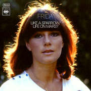 Since not only the thread has become a ground for revising (or imagining) one of the ABBA members'/ABBA's single/album covers, I think I'd like to add some twist to it because there are plenty of ideas that are easily accessible at instead of trying to spend hours on working on gatefolds of Frida's albums If one of the songs from 'Frida Ensam' had attention in Great Britain... they'll figure out the translation once they get the Swedish import of 'Frida Ensam' :-) The CBS emblem in the single cover photoshop I made has a nicer fit than Vogue or Epic Records since they don't make your eyes scrambled. |
|
|
|
Post by The Rubber Ball Man on Mar 15, 2017 15:35:15 GMT
Font for I Know There's Something Going On:- Horsham Bold
|
|
|
|
Post by The Rubber Ball Man on Mar 20, 2017 21:48:44 GMT
|
|
|
|
Post by The Rubber Ball Man on Mar 20, 2017 22:12:35 GMT
|
|
|
|
Post by wombat on Mar 21, 2017 15:25:17 GMT
are those two intentionally hot in the yellow?, or, did you have difficulty with the coloring in general (as I did, if you got the pic off the album sleeve, its one of the worst printed pics in history)... I couldnt ever get that stupid pic to look right ;-)
|
|
|
|
Post by Fafner on Mar 21, 2017 15:30:21 GMT
are those two intentionally hot in the yellow?, or, did you have difficulty with the coloring in general (as I did, if you got the pic off the album sleeve, its one of the worst printed pics in history)... I couldnt ever get that stupid pic to look right ;-) It's not the same but similar shot - s1.postimg.cc/vqhx8u1ql/P0027017.jpg |
|
|
|
Post by wombat on Mar 21, 2017 16:58:49 GMT
great pic! I've seen that one, on a cover sleeve of I See Red, altho I am not sure if that was a Polar release or a fan made pic. However I think the two pics above in question, might have been made with the awful picture of Frida from the inside sleeve of the Somethings Going On album  |
|
|
|
Post by Fafner on Mar 21, 2017 17:14:32 GMT
great pic! I've seen that one, on a cover sleeve of I See Red, altho I am not sure if that was a Polar release or a fan made pic. However I think the two pics above in question, might have been made with the awful picture of Frida from the inside sleeve of the Somethings Going On album  Found it on rockshot  And with some retouching -  |
|
|
|
Post by The Rubber Ball Man on Mar 21, 2017 17:20:19 GMT
Yes, it was that photo but I tried to make it more    interesting. |
|
|
|
Post by wombat on Mar 21, 2017 21:51:08 GMT
thats a lot better source fafner, thanks
I might play around with that on my own.. sure is better than the one on the album sleeve
I cant decide if it was a printing accident or somebodys terrible "cool" idea
|
|