|
|
Post by The Rubber Ball Man on Mar 12, 2017 9:08:51 GMT
|
|
|
|
Post by Liebezeit on Mar 15, 2017 0:19:00 GMT
Please change your topic title to 'Agnetha fan-made single covers' – that change could remedy the confusion between her official single covers and the Agnetha fanmade single covers for someone new who may stumble upon this thread all of the sudden.  
Looks like a Record Store Day reissue innit? |
|
|
|
Post by The Rubber Ball Man on Mar 15, 2017 15:33:23 GMT
Useful fonts:-
WYAAM - Cochin
Eyes Of A Woman - legende
|
|
|
|
Post by Liebezeit on May 11, 2017 3:56:18 GMT
Well, since this section (Agnetha Single Covers) is full of fan-made album/single covers, I decided to post these fan-made album images out of curiosity. These look somewhat like it could be official but it's actually fan-made. :-) Sony sure does have a simplistic design that makes any music fan want to design an 'Essential' album art for an artist who hasn't have their proper release for 'The Essential' series...  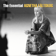
The Agnetha hat cover is supposedly depicting the European release while the Agnetha stage is depicting generally international releases outside Europe... It's very typical if research is done considerably! |
|
|
|
Post by Liebezeit on May 11, 2017 23:06:35 GMT
   The ABBA members deserved to have their own 'Gold: Greatest Hits', I'll be honest – ( Frida counterpart here) EDIT: CORRECTED VERSION 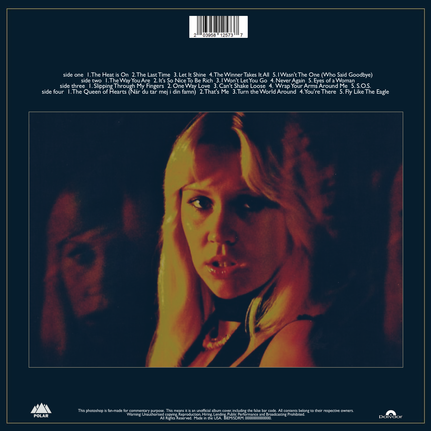
Click the image for high res |
|
|
|
Post by WATERLOO on May 15, 2017 16:13:16 GMT
Do you have a bigger version of the Agnetha GOLD back cover? The cover looks amazing, btw.
|
|
|
|
Post by Liebezeit on May 15, 2017 20:31:13 GMT
Do you have a bigger version of the Agnetha GOLD back cover? The cover looks amazing, btw. Thanks!  How many resolutions, according to your standards? 3500x3500? The original image was uploaded at 1491x1491, by the way If you'd like to have the non-barcoded version of this, don't hesitate to ask   |
|
|
|
Post by Liebezeit on May 15, 2017 21:08:05 GMT
Not being critical, but look at "The Heat is On". Alex, instead of telling me to look at something, why don't you explain what's wrong with the picture? It helps for me because I'm quite notorious for not being overly detailed, plus, the explanation encourages me to improve a particular spot that I may have a weakness in. I'd like to know which mistakes fell with my clumsy brain  It took me a while to figure out what you're saying, so, if that's not what you're looking for, have the explanation ready – maybe write at least a paragraph of a comment on what's good and which spot is left to be desired? 
"Pressing manufacturer corrected print"  ...and a bigger one 
Close up of the fixed version – I'm trying to be consistent with the format, haha! My texts aren't even meant to be symmetrical for some reason, and it's got to do with the content of the text being typed.. If you have several longer music title on the first section, but shorter music titles on the second section, it's imbalance, but I doubt if anyone cares about the symmetry of tracklists. It's not really important unless if you have the tightest space within a design...  For those reading – lay all your constructive criticism on me (pun intended). I've got no problem with it and I'd love to analyse my flaws on 'Agnetha Gold' carefully... |
|
|
|
Post by WATERLOO on May 16, 2017 19:24:38 GMT
Thanks!  How many resolutions, according to your standards? 3500x3500? The original image was uploaded at 1491x1491, by the way To be honest, I'd love to have just the picture, without your cover art although it is – as I said – amazing. |
|
|
|
Post by Fafner on May 16, 2017 19:43:14 GMT
|
|
|
|
Post by Liebezeit on May 16, 2017 21:41:22 GMT
Thanks Fafner for the high res photo (Someday I might try to blend it all together with other sources of image, but there's a scarce source of this similar image...) – WATERLOO , the source picture I used, was originally small, but I resized it, so I used this picture as it's more radiant than what Fafner posted – I don't know how the enlarging in my cover art came to be, as it looks surprisingly smooth, in my opinion, but it's probably my raster graphic editor that did the unthinkable – I use the 'darken' blending when composing my fan-made cover art.. Actual source pic for my fan-made cover art: 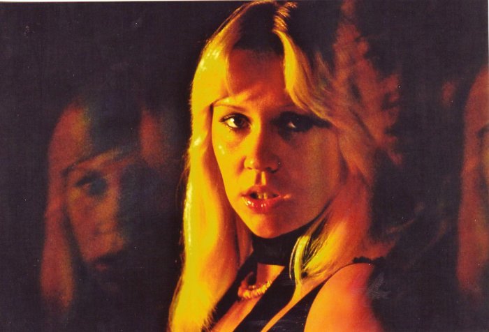 |
|
|
|
Post by WATERLOO on May 17, 2017 18:27:49 GMT
Thanks you two.
|
|
|
|
Post by Liebezeit on Jun 15, 2017 2:41:52 GMT
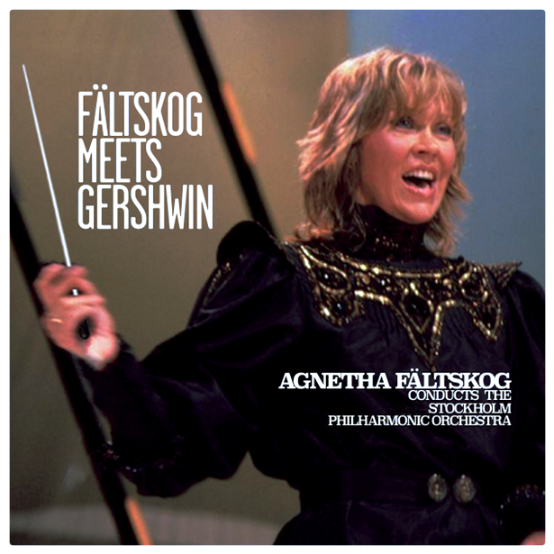 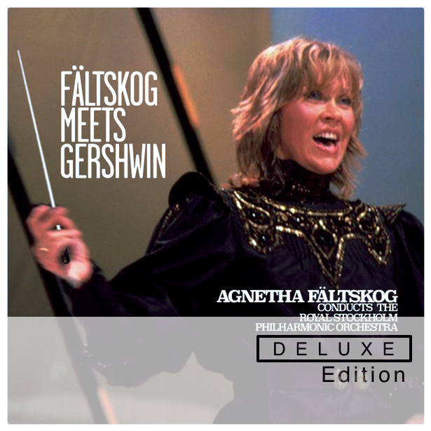
I just don't see the consequences of thinking outside the boxes... of course, it's also fan-made... (the pretend-deluxe edition includes bonus tracks of her orchestra mistakes and her orchestra playing her pre-ABBA music, except, it's conducted by her...) |
|
|
|
Post by Liebezeit on Aug 10, 2017 11:08:00 GMT
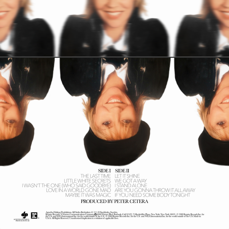 
I Stand Alone deserves a better artwork treatment, in my opinion. Here's a lazy but effective interpretation of the artwork. The original artwork was a bit tacky as it resembled something of an indie Swedish movie poster of the 1980s
|
|
|
|
Post by Liebezeit on Aug 31, 2017 2:18:25 GMT
 If Agnetha had enough unreleased materials recorded during her time with ABBA.. and before and after ABBA that she reworked it at a later period... now that would be a dream. Including "I'm Still Alive", "The Queen of Hearts" and "Fastnat i skorsten" a bad Swedish "schlager-rhyming" translation of "More than a Feeling", this (blatantly fake) album would blow any of ABBA's music away as Agnetha's voice is "faster than the speed of light" as any critics would say... |
|
|
|
Post by Liebezeit on Sept 21, 2017 20:51:48 GMT

Just a front design of the "Wrap Your Arms Around Me" limited edition LP picture disc based out of Mankowitz's photography... |
|
|
|
Post by kruspetiddies on Sept 15, 2018 16:22:35 GMT
Some covers that I made:   |
|
|
|
Post by ABBAinter.net on Sept 15, 2018 21:45:53 GMT
|
|
|
|
Post by kruspetiddies on Oct 27, 2018 12:20:20 GMT
|
|
|
|
Post by The Rubber Ball Man on Apr 5, 2020 23:16:05 GMT
|
|
|
|
Post by The Rubber Ball Man on Apr 5, 2020 23:25:12 GMT
Probably haven’t posted these here. 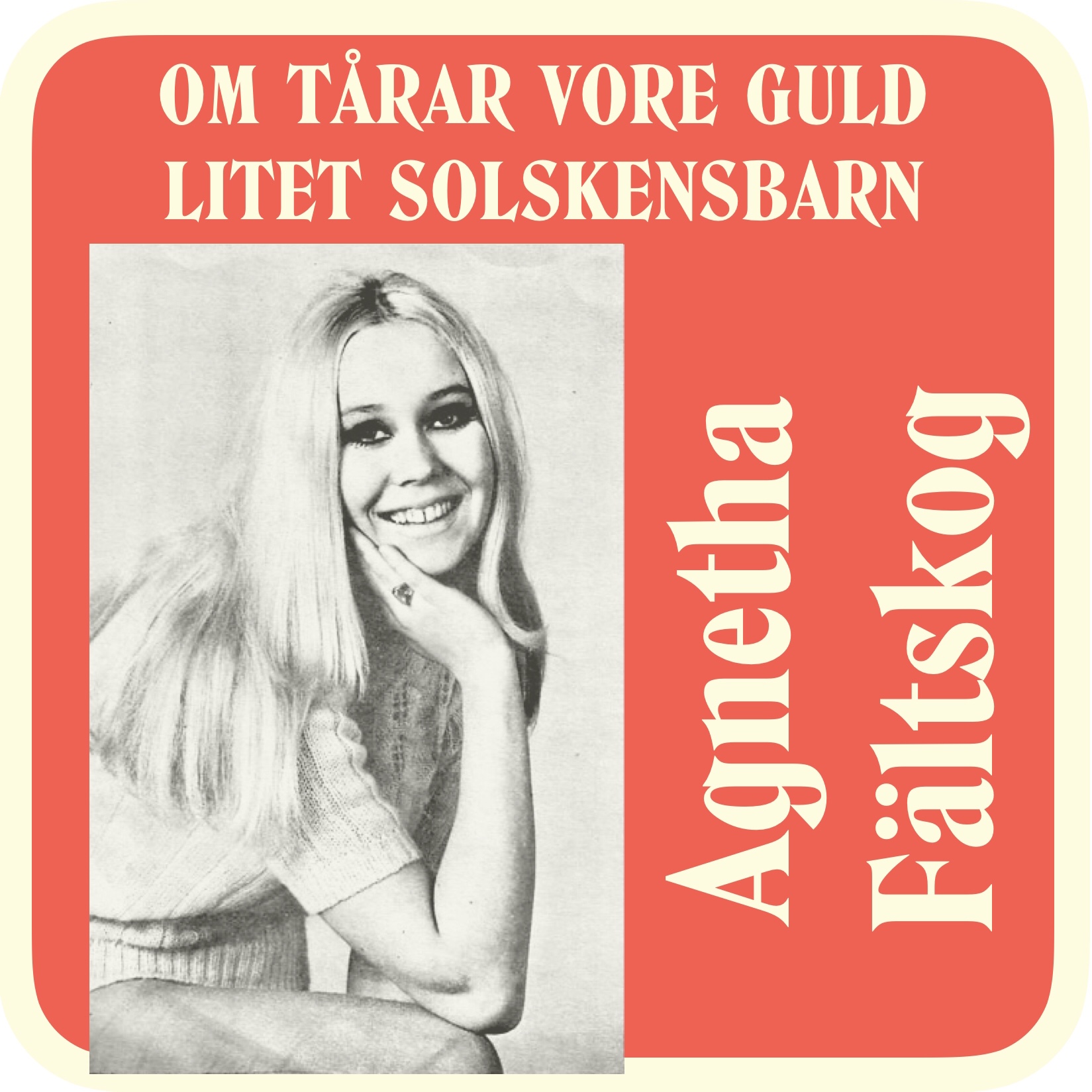  |
|
|
|
Post by The Rubber Ball Man on Apr 14, 2020 17:49:31 GMT
I've always wanted to recreate a cover for this but now with the good quality photo used, here it is.  |
|
|
|
Post by The Rubber Ball Man on Jan 24, 2021 21:17:07 GMT
|
|
|
|
Post by Alan on Jun 28, 2024 17:06:18 GMT
|
|
|
|
Post by Tinneke on Jun 30, 2024 14:40:29 GMT
Agnetha was being produced by Mike Chapman who I had worked with a great deal in the 70s; and he asked me to come to Sweden, where they were recording, to shoot this cover. Agnetha was charming, very sexy and photogenic – we had a lovely session together. When I got home to London there was a huge bouquet of flowers waiting – a thank you from her, and a sweet and thoughtful gesture!
📸 by Gered Mankowitz / cover Wrap your arms around me
|
|